Recur, Subscription Management
UX Designer • 2 months• Figma, Photoshop, Google Meet, Pen & Paper
The popularity of subscription-based products is on the rise. With concerns about deceptive tactics used by companies to extend subscriptions, there's a demand for streamlined subscription management solutions. Recur is a subscription management app that aims to address these issues as well as help users meet long term financial goals.
Timing
2 months
Problem Context
How might we make it easier for users to view all their subscriptions in one place?
How might we prepare users to plan for current and future bills?
How might we help users to reach their long term financial goals?
Deliverables
Research-informed MVP
Clickable Figma prototypes
3 rounds of in-depth interviews with 4 participants each, totalling 12 interviews
Final case study documenting the design process

Discovery Phase
To understand the problem space, I conducted research into how users manage subscriptions. First was secondary research to give me a quick glimpse at the project constraints and jog some creative ideas, then user interviews to help me understand user pain points and struggles, and lastly personas, which helped me develop empathy and understanding going into the research synthesis phase.
Research Highlights
After scouring various forums and interviews, I identified some key insights:
Keeping up with your subscriptions is hard: Users expressed a lot of frustration and annoyance at keeping up, managaing and planning for current and future bills.
Canceling or negotiating unwanted subscriptions can be difficult and time consuming: Companies purposely impede how easy it is for us to cancel subscriptions. I heard multiple times how time-consuming it was to remove or negotiate an unwanted subscription.
Keeping organized is difficult: Standard banking apps dont provide the necessary organizational tools that users need to keep track of their finances.
Existing products don’t incentive long term goals: Existing subscription management services are targeted towards users who just want to address immediate financial hardship, and don’t generally accomodate long term goals.
Using these insights, I drafted some initial jobs to be done that inform the design phase of the project
Personas
After my initial user research, I used the insights I found to create 2 personas that reflected the user types I saw emerging from interviews and secondary research, which represent 2 ends of the subscription frustration spectrum. Exploring user needs on both ends of that specturm helped me build empathy as I went into the synthesis phase of the project.
Synthesis Phase
Following the discovery phase of the project, I began trying to synthesize my learnings. In this phase I employed Affinity Mapping, Journey Mapping and creating a list of prioritized features that were distilled from my Jobs to be Done.
Affinity mapping
The first task I did during this project phase was to cluster like ideas and insights from what I had learned in my reserach phase to understand patterns of user behavior and emotions. This map helped guide concepting during the ideation phase of the project.
Journey Mapping
After clustering my findings via affinity maps, I used journey mapping to chart the initial end to end experience. I specifically focused on the user pain points and moments of joy as they worked through the experience.
Jobs to be Done
The last step of the synthesis process was identifying key jobs to be done to inform the design phase, prioritizing according to the project scope.
Initial Design Phase
After synthesizing findings, I kicked off the design phase. In this phase I utilized lo-fi Sketching, mapping out the structure of the experience with a Sitemap, and clickable Lo-fi Prototypes that I would test for usability.
Sketching
Rough thumbnails were created to quickly lay out ideas fast and explore and map out product feature sets.
Sitemap
A sitemap further fleshed out major feature sets and site organization.
Lo-fi Mockups
After mapping out the site, I built out Lo-fi mockups of both desktop and mobile experiences for my main design red routes. These were then made clickable to help fully solidify interaction model and to use for user testing.
Mobile Lo-fi mock ups
Design Refinement
Following the low fidelity design phase and user testing, I began the High fidelity prototyping phase. I established a visual theme and developed hi-fi prototypes implementing usability learnings for both mobile and desktop.
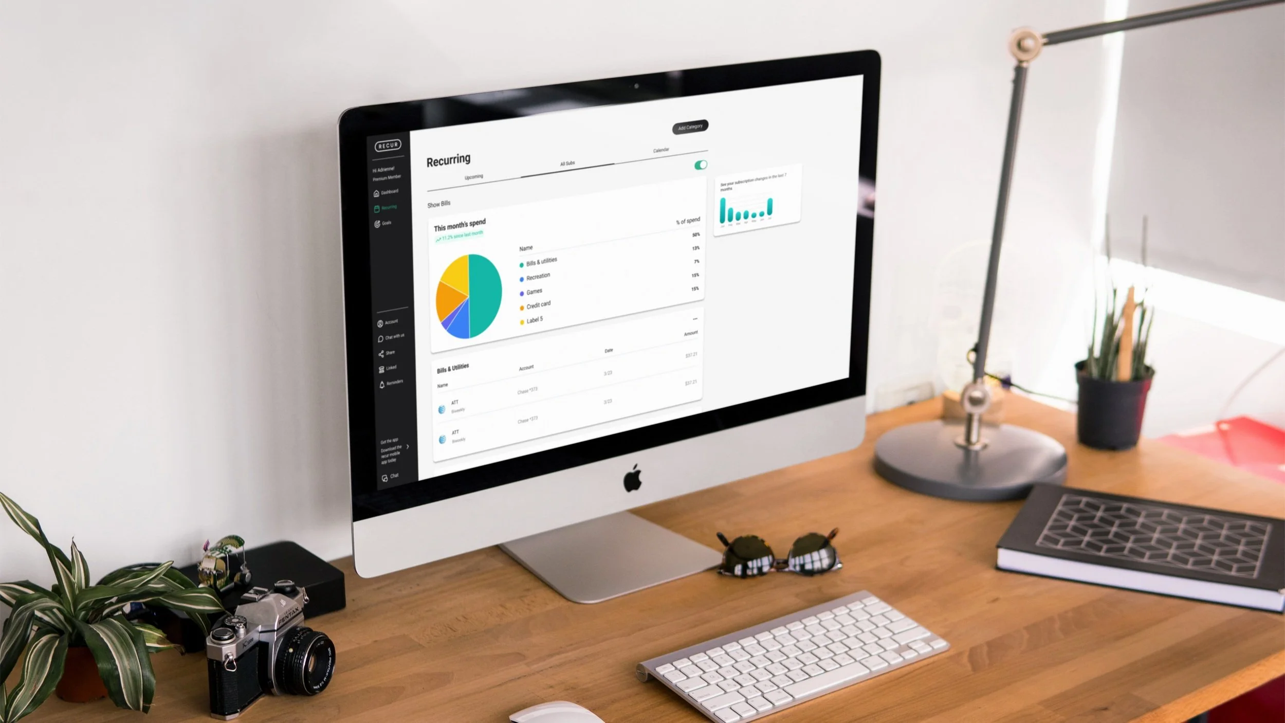
Desktop Hi-fi mock ups
Desktop designs leveraged larger screen real estate to display primary, secondary and tertiary information.
Mobile Hi-fi mock ups
Usability Testing
After building clickable prototypes, I conducted 2 rounds of usability testing to identify usability concerns and areas for improvement. I created a prioritized feature list after each round, updating and refining designs between rounds.
Project Learnings
This project flexed my skills in designing for dense visual and information hierarchy with complex sets of data. Keeping everything organized, logical, and simple to navigate for the user was challenging and rewarding. This also introduced me to the hierarchical differences in designing desktop vs mobile experiences, and how effect information architecture.